
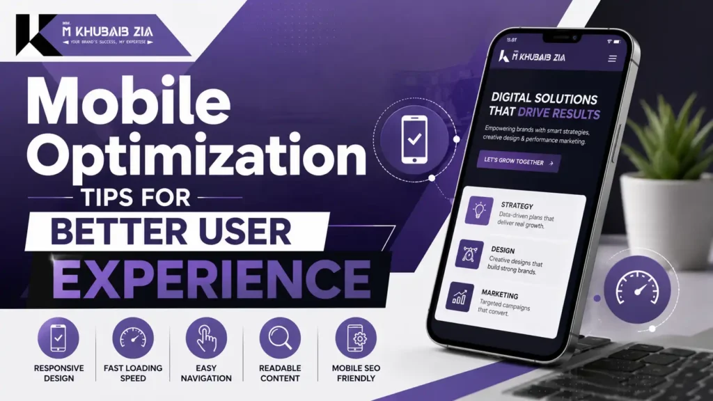
Mobile optimization makes a website faster, easier to read and simpler to use on a touchscreen without removing important content. Mobile optimisation means making a website fast, readable and easy to complete on a small touchscreen—not shrinking a desktop page until it fits. A good mobile experience lets a visitor understand the offer, navigate, fill a form and recover from an error without pinching, guessing or waiting.
Google also primarily indexes the mobile version of a site, so missing mobile content or metadata can become a search problem as well as a usability problem.
Start mobile optimization with responsive design
Responsive design uses one set of URLs and adjusts the layout to the available screen. It is usually easier to maintain than separate mobile URLs. Define sensible breakpoints based on when the content stops working, not on a list of fashionable device models.
Test long headings, translated text, large browser fonts and landscape orientation. A layout that works only with short sample copy is not robust.
Keep important content equivalent
Mobile pages should contain the same important text, headings, images, links, metadata and structured data as desktop pages. Reordering content for a smaller screen is fine; removing the main answer is not.
Avoid hiding critical content behind interactions that search crawlers or users may not trigger. Accordions can organise long pages, but their labels must be clear and the content should remain available in the rendered HTML.
Make the first screen useful
The top of a mobile page has little space. Use a concise heading, a direct explanation and one relevant next action. Do not let a giant logo, empty hero, consent banner and multiple pop-ups consume the entire viewport.
Keep sticky headers slim. If a call button or chat control is fixed to the screen, make sure it does not cover form fields, cookie choices or navigation.
Improve loading and responsiveness
Start with real-user field data when available. Common “good” Core Web Vitals thresholds at the 75th percentile are LCP at or below 2.5 seconds, INP at or below 200 milliseconds and CLS at or below 0.1.
Practical improvements include:
- Resize and compress hero images instead of sending a desktop original to every phone.
- Use WebP or AVIF where supported, with an appropriate fallback when needed.
- Reserve image and embed dimensions to prevent layout movement.
- Remove unused scripts and styles from templates that do not need them.
- Delay non-essential third-party widgets and review their business value.
- Cache stable assets and improve server response time.
- Break long JavaScript tasks so taps receive feedback quickly.
Do not optimise for a single lab score. Test representative page templates and track field performance after release.
Design navigation for a thumb
Use a visible menu control with an accessible name. Keep labels short and group related items. A user should be able to return home, reach the primary service and contact the business without opening several nested panels.
Make touch targets large enough to select reliably and leave space between them. Provide visible focus states for keyboard and assistive-technology users. Do not rely on hover to reveal essential information.
Make text comfortable to read
Use a readable base font and line height. Keep paragraphs reasonably short, but do not turn every sentence into a separate block. Maintain strong contrast and allow the browser to zoom.
Avoid full-width tables with many columns. Convert comparisons into cards or allow controlled horizontal scrolling with clear labels. Long URLs and unbroken text should wrap instead of pushing the page wider than the screen.
Simplify mobile forms
Ask only for information needed at that stage. Use the correct input type for email, telephone and numbers so the useful mobile keyboard appears. Put labels above or beside fields, not only inside placeholders that disappear during typing.
Show errors next to the relevant field and explain how to fix them. Preserve entered values after an error. Let users review important details before submission, then display a clear success message.
Optimise calls, messaging and location actions
A phone number can be tap-to-call, but it should also be visible as text. Messaging buttons should explain what happens next rather than opening an app unexpectedly. For location links, use the correct business address and test the destination.
Track these actions once in analytics. Duplicate tags can inflate conversions and hide real user behaviour.
Handle images and video responsibly
Use responsive image sizes so the browser can choose a suitable file. Lazy-load images below the first screen, but do not delay the main hero image without testing. Add descriptive alt text when the image communicates information.
Video needs controls, captions where speech matters and a poster image that does not weigh down the page. Never force autoplay with sound. Consider whether an embed can be loaded only after the user chooses to play it.
Avoid intrusive interruptions
Large interstitials, repeated newsletter prompts and aggressive chat pop-ups make small screens difficult. Time prompts after the visitor has received value and provide an obvious close control.
Consent choices should remain usable without hiding the page or forcing accidental taps. Test them on a short phone screen, not only a desktop simulator.
Test on real devices and slow conditions
Browser responsive mode is a useful first pass, not the finish line. Test at least one real iPhone and Android device if possible, plus keyboard navigation and screen zoom. Try a slower connection and a mid-range device.
Complete the important journeys: open from search, navigate to a service, submit a form, call, use messaging, rotate the screen and recover from a validation error. Record the device, browser, page and exact problem so fixes can be retested.
No. It can still be slow, cluttered, hard to tap or missing important content. Responsive layout is the foundation, not the complete experience.
They can be organised differently, but the important answer and supporting evidence should remain available. Remove repetition, not necessary information.
LCP, INP and CLS measure different parts of the experience. Review all three in field data and investigate by template.
No, but they should be proportionate, easy to close and not prevent access to the main content.
Test before each major release and after changes to navigation, forms, consent tools, themes, plugins or third-party scripts.
Build for the real journey
The strongest mobile websites feel calm: the content arrives quickly, the next action is obvious and controls behave as expected. Start with responsive structure, content equivalence, performance, navigation and forms. Then test complete user journeys on real devices. Those improvements support both visitors and search visibility without relying on tricks.